Every Lincoln cafe, builder, salon, and shop deserves a website that matches the quality of what they actually do — not a £19/month template trap. Zebweb exists to make premium feel local, and local feel premium.
The striped Z.
One letterform. Stripe-filled. The whole studio in 60×60 pixels.
Built on a 60-unit grid. Z stroke at 8 units, corner radius 14 units. Don't reconstruct — use the supplied SVG.
Always leave at minimum half the mark's width as breathing room on every side. More is fine, less is not.
16px is the absolute floor — favicon, in-line nav. Below that the stripes start to mush. Don't.
Five ways to say it.
Use horizontal by default. Stack only when you have to. Wordmark and mark stand alone when the other isn't possible.
Default. Use everywhere — header, signature, deck cover.
For square containers — avatar, business card front, Instagram post.
Favicons, app icons, anywhere too small for type.
Editorial use, hero typography, when the mark would compete.
Reserved for cover art, decks, big-format applications. Don't stick this on every page.
Six skins. One mark.
Pick the variant that matches the surface. Don't invent new ones.
Default everywhere. Cream-on-ink stripes. Works on light surfaces.
Reverse stripe pattern for dark surfaces.
Accent-only — campaigns, special applications. Use sparingly.
Single-colour. Solid cream Z on ink. Embroidery, small sizes.
Single-colour. Solid ink Z on cream. Stamps, fax, low-res print.
Last resort. Where stripes can't render — engraving, etching.
Six ways to ruin it.
The mark is fragile if you mess with it. These are the six things you don't get to do.
ELSE
Three colours. No more.
Ink and limestone do the work. Volt is the spark. Don't add a fourth.
Three voices, one feeling.
Fraunces speaks. Bricolage explains. JetBrains labels. Don't mix the jobs.
Hero headlines and section titles. Use italic light weight for editorial emphasis on one word per headline.
abcdefghijklmnopqrstuvwxyz
0123456789 £$€¥ &@#%
All body copy, UI labels, navigation. Set tight, kept honest.
abcdefghijklmnopqrstuvwxyz
0123456789 £$€¥ &@#%
Prices, eyebrows, codes, postcodes. Always uppercase, always tracked at 0.2em.
0123456789 £$€¥ &@#%
Display in Fraunces, body in Bricolage, labels in JetBrains. Never swap. Never substitute.
Italicise one word per headline. The most important one. Not two. Not a phrase.
Display: -0.04em. Body: default. Mono labels: uppercase, 0.2em. Never tighten body. Never loosen display.
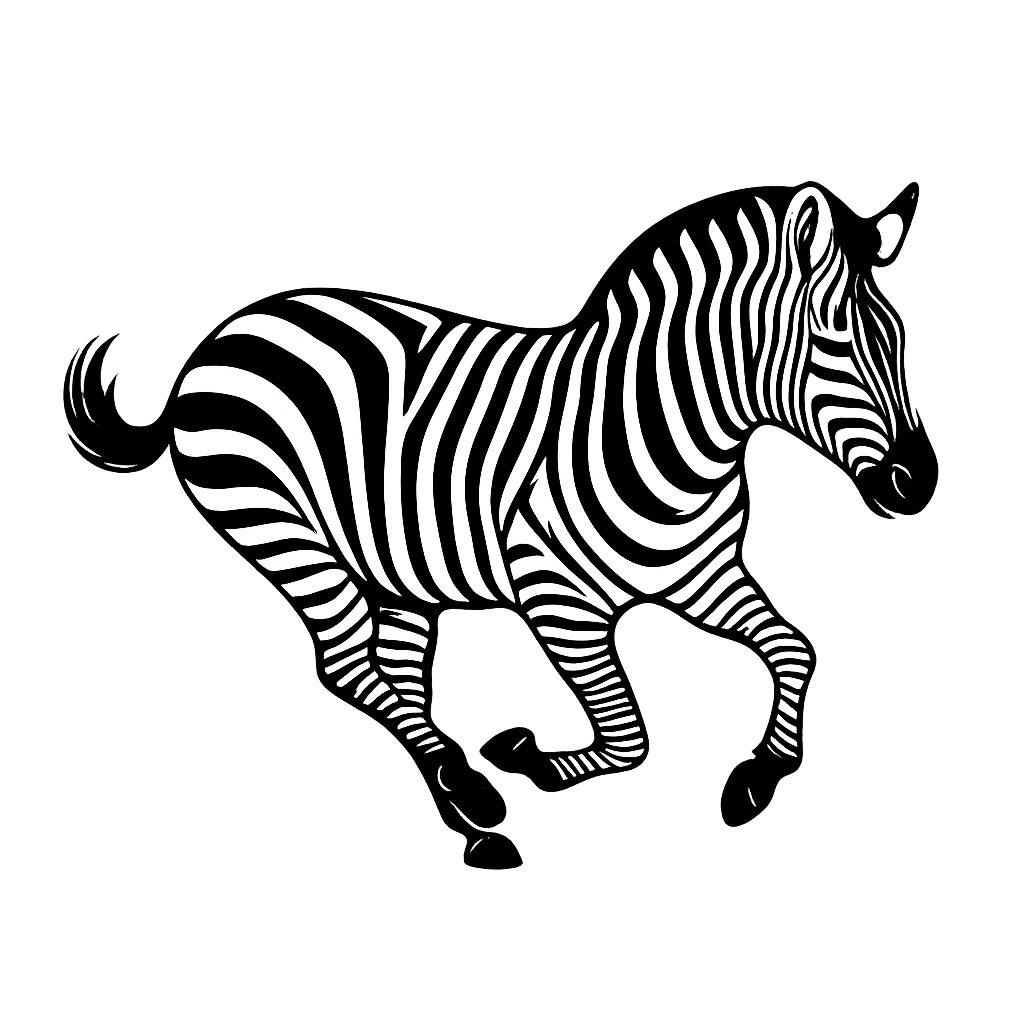
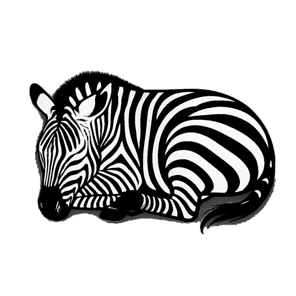
Zebras and stripes.
The vector zebra family + the stripe pattern. Use one zebra per surface — they don't share.
Hero use only. Energy, motion, standing out.

Default illustration. Calm, steady, working.

Quiet sections. Refresh, breaks, bottom of page.
Coming soon, downtime, footer flourishes.
Tile this as a section background, use cropped slices as accents, or set it as a fill behind a card. Never as the only surface — always paired with cream or ink for contrast.
Volt + ink corner stripe. CTA card top-right corners only — never as a full surface.
Plain-spoken, quietly cheeky.
Write the way you'd talk to a small business owner over a flat white. Not a pitch. Not a press release. Just a chat.
Short sentences. Real words. No throat-clearing.
Say the price. Say the timeline. Don't oversell.
A wink, never a wisecrack. Confident, never smug.
Name the thing. Lincoln. £350. Vercel. 48 hrs.
The brand in the wild.
How it shows up in stationery, signatures, invoices, and avatars.
Founder
Louis Founder · Zebweb hello@zebweb.co.uk zebweb.co.uk Steep Hill, Lincoln |
Steep Hill
Lincoln, LN2
Lincoln Business Park
LN6 4AB
A brand book is a starting point, not a cage. If you need something not in here, ask. Then we either add it or talk you out of it.
- ZBW–BK–001
- v1.0
- 2026
- Lincoln, UK
- Fraunces
- Bricolage Grotesque
- JetBrains Mono
- Lucide icons